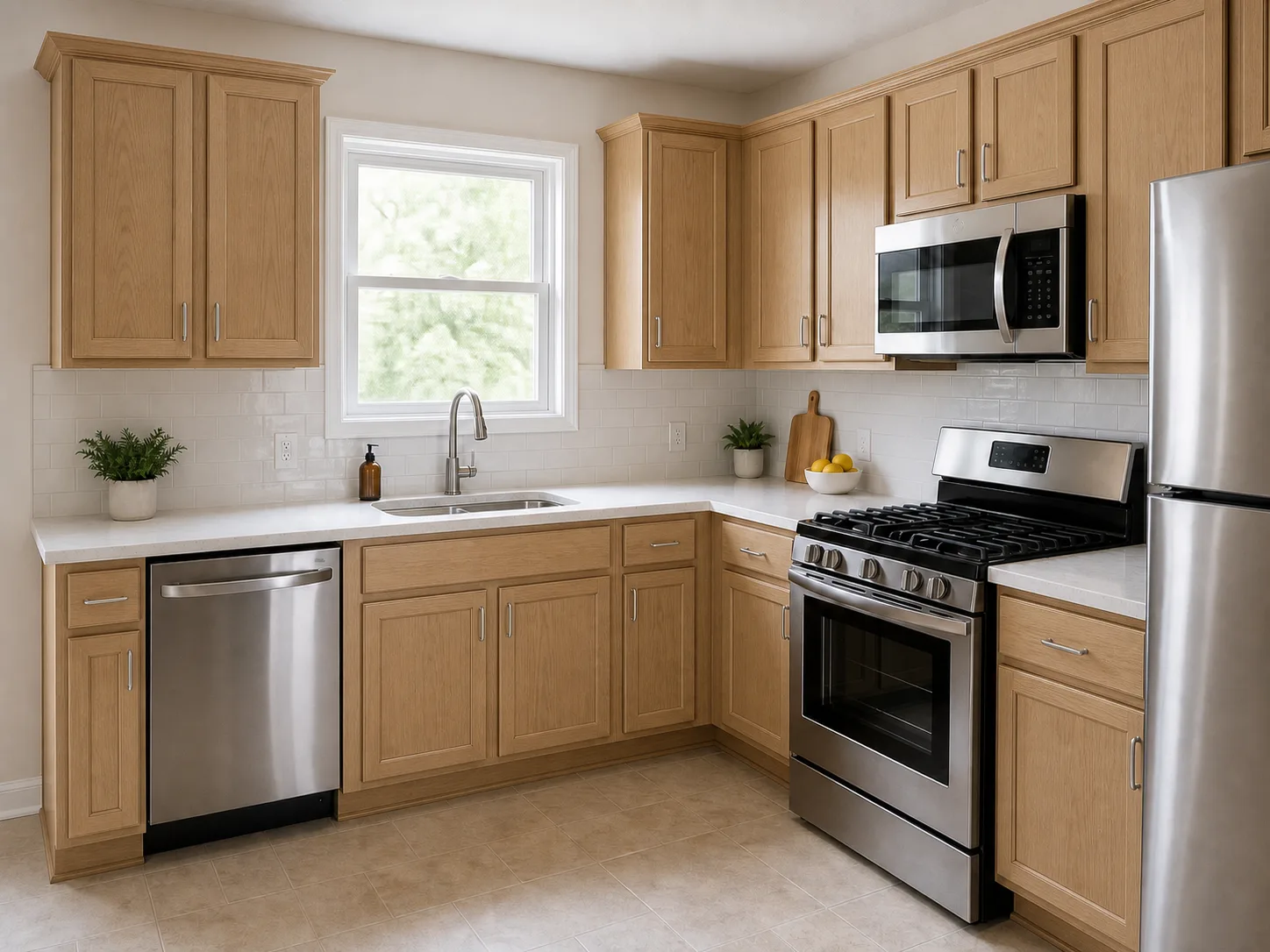
Natural and clear
Keeps the wood close to its original tone and grain.
- Works for
- When you want the original wood color and grain to lead the room.
- Check
- Natural color and grain variation will remain part of the finished look.
Cabinet finish guide
Compare the main stain families side by side, then test a light or dark wood direction against your real kitchen surfaces.
The AI preview is for finding a direction, not an exact match. It cannot reproduce a specific stain, wood species, or sheen, so confirm the final finish with a physical sample on the actual wood.
The short answer
There is no universal best stain. Start by choosing a family: natural and pale for a lighter direction, medium brown for more warmth, walnut or espresso for stronger contrast, or gray and taupe for a cooler undertone. Then compare that family on the actual wood and beside the surfaces already in your kitchen.
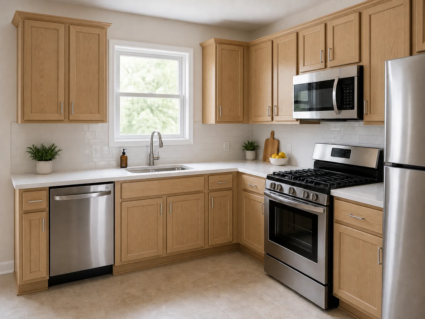
Manufacturers use different names, so compare the underlying color family and undertone instead of relying on a product name alone. The same illustrative kitchen and fixed surfaces stay consistent across the images so you can compare broad cabinet directions, not exact manufacturer finish matches.
Keeps the wood close to its original tone and grain.
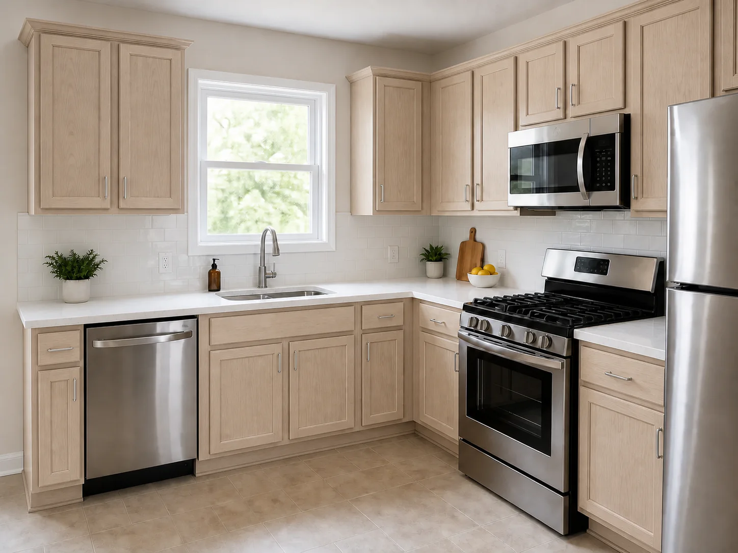
A light tan or softly washed direction.
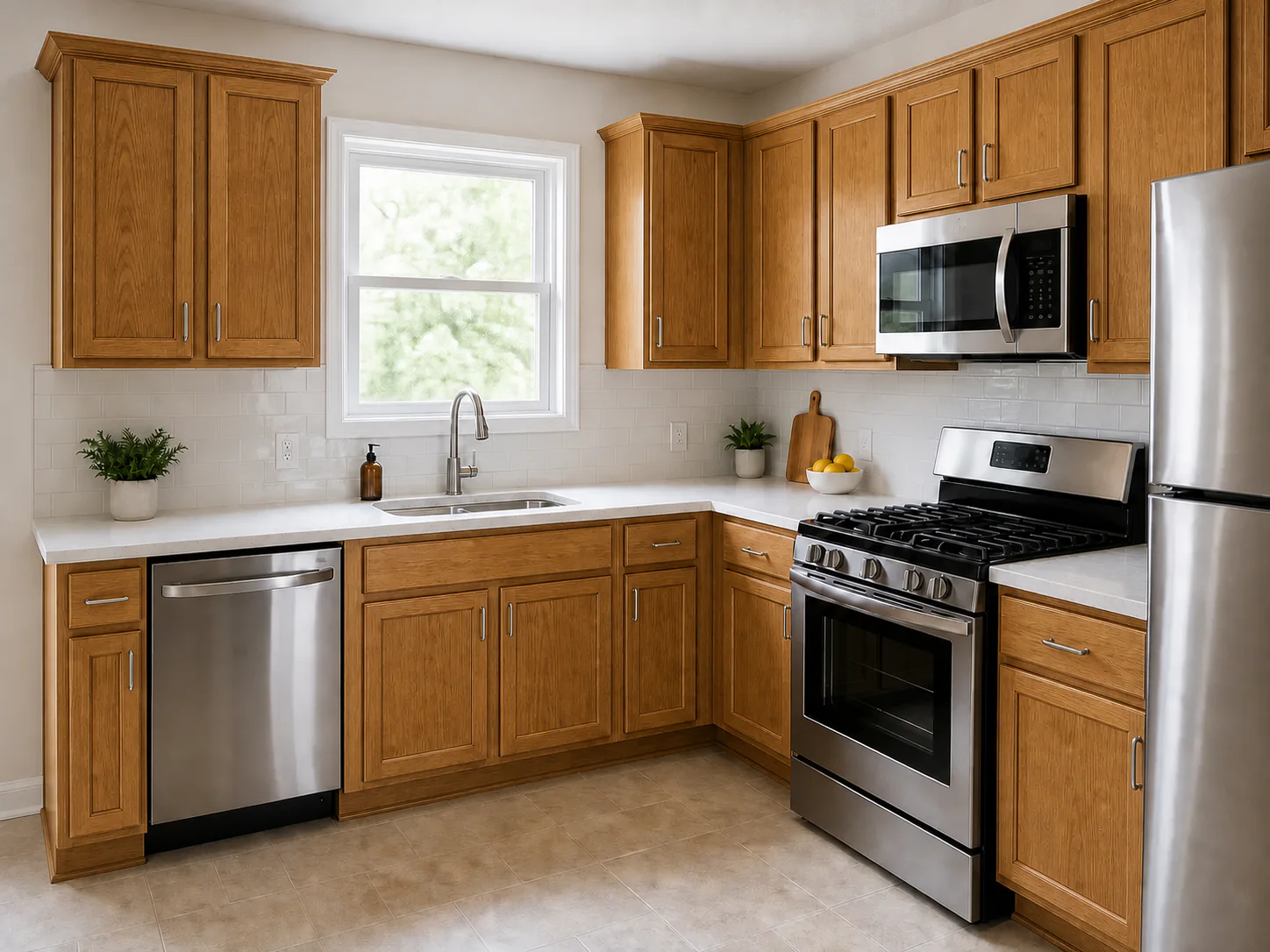
A warm golden-brown direction with visible wood character.
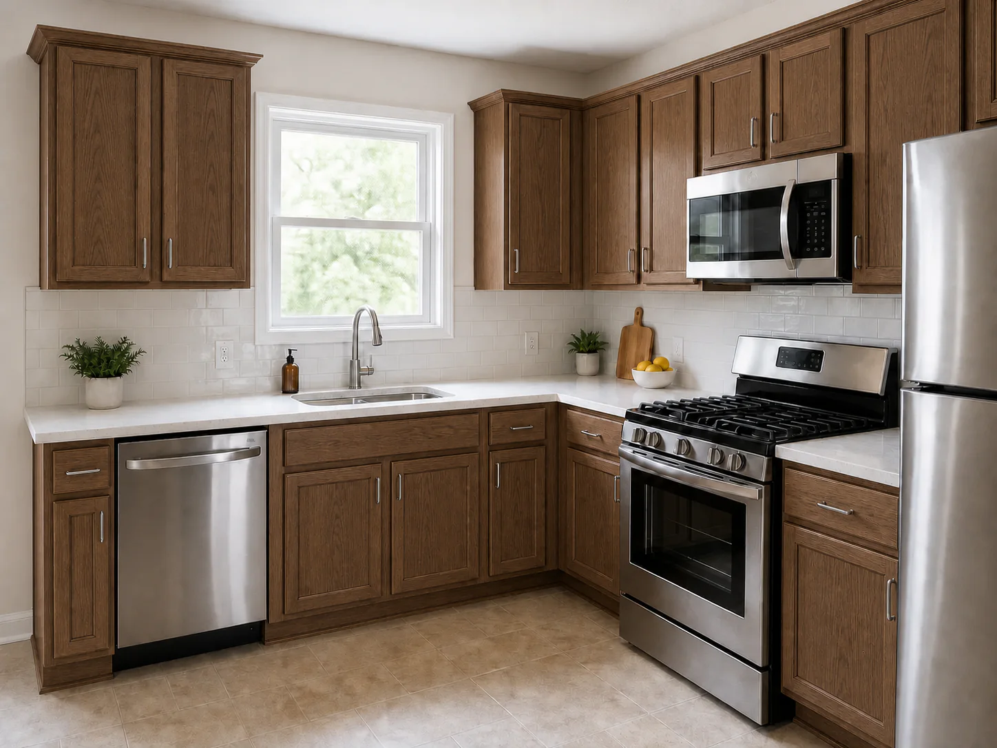
A balanced brown that adds depth without going very dark.
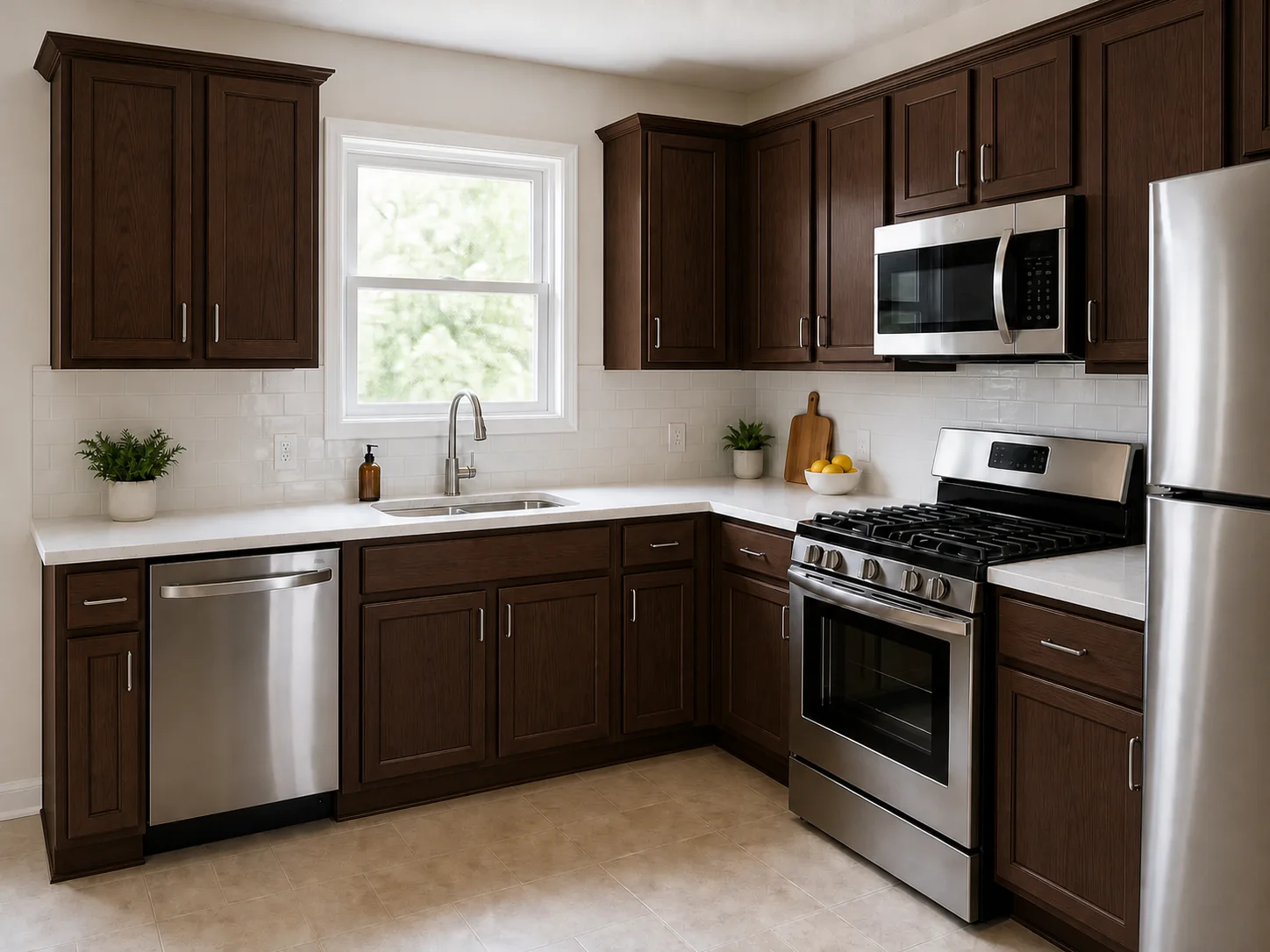
A deep brown direction that feels grounded and refined.
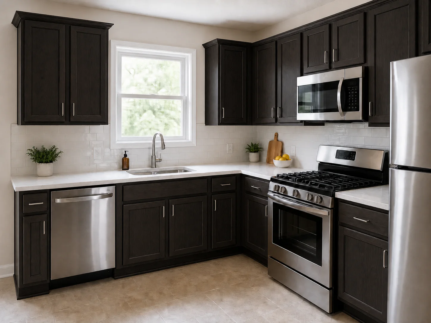
A near-black brown that keeps a hint of wood warmth.
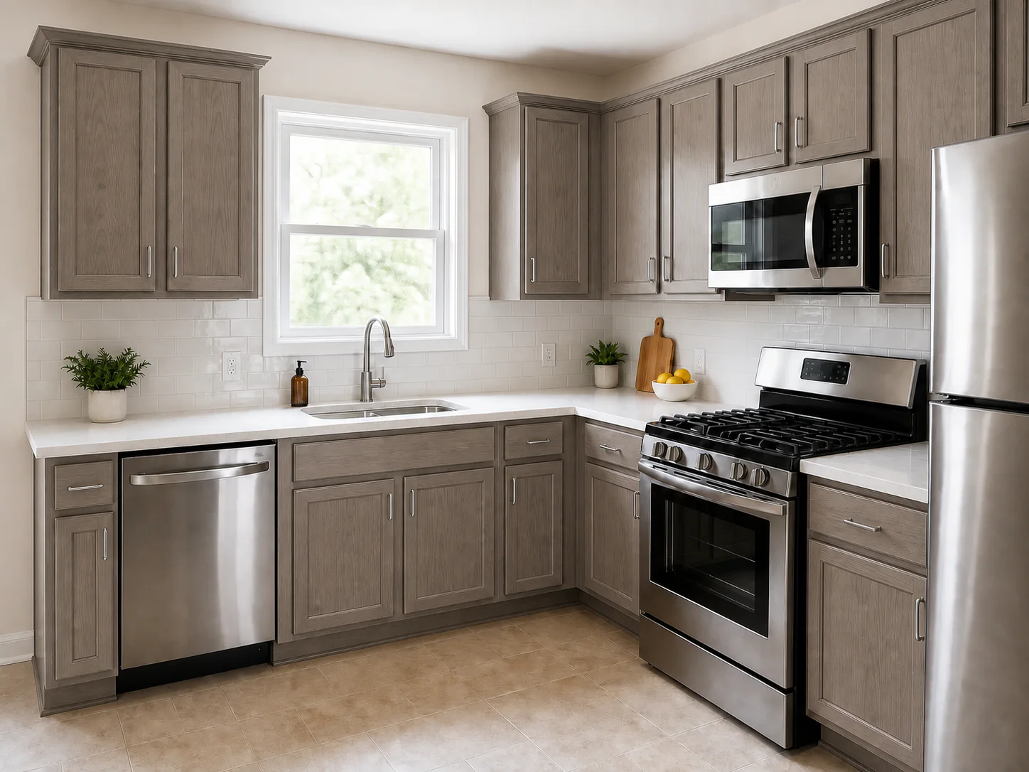
A cooler brown or gray direction with a quieter undertone.
Planning to combine a stained wood finish with painted cabinets? Use the two-tone kitchen cabinet guide to compare where each finish should sit and how the pair works with the room.
Use this chart to shortlist one or two families before ordering samples. Every column describes a tendency, not a guarantee: the wood species, grain, preparation, finish process, sheen, and lighting in your room can all shift the result.
| Family | Lightness | Typical undertone | Shortlist when | Main risk | How the wood can change it |
|---|---|---|---|---|---|
| Natural and clear | Lightest | Follows the wood’s own tone | When the wood species and grain should lead the room. | Natural color and grain variation stays visible. | The wood character remains central to the result. |
| Pale neutral | Light | Soft tan to neutral | When you want a light look with low contrast. | Lighter stains can expose more wood variation. | The base color and grain are likely to stay noticeable. |
| Honey and golden | Light to medium | Warm yellow-gold | When the fixed finishes already lean warm. | Can turn more orange than intended beside warm floors. | A warm wood base can amplify the golden direction. |
| Medium brown | Medium | Neutral to warm brown | When you want depth without going dark. | Undertone clash with countertop, backsplash, or floor. | The starting wood can shift the visible undertone. |
| Walnut brown | Dark | Deep warm brown | When you want contrast against pale surfaces. | Can feel visually heavy in a compact or dim room. | Some grain and base-color differences can remain visible. |
| Espresso | Darkest | Near-black with a warm edge | When you want high contrast beside light surfaces. | Can mute natural grain and variation in the wood. | A very dark finish may reduce visible differences. |
| Gray and taupe | Light to medium | Cool gray-brown | When the fixed surfaces already lean cool. | Can look flat or dull under some lighting. | A warm wood base can pull the result away from cool gray. |
A stain is only half of the result. The grain pattern, natural base color, and absorption of the wood under it decide the rest. These are common tendencies, not rules, and individual boards can differ.
These controlled images keep the door style, camera, and lighting consistent while showing a natural-clear direction for each wood. They illustrate broad differences, not supplier finish samples.
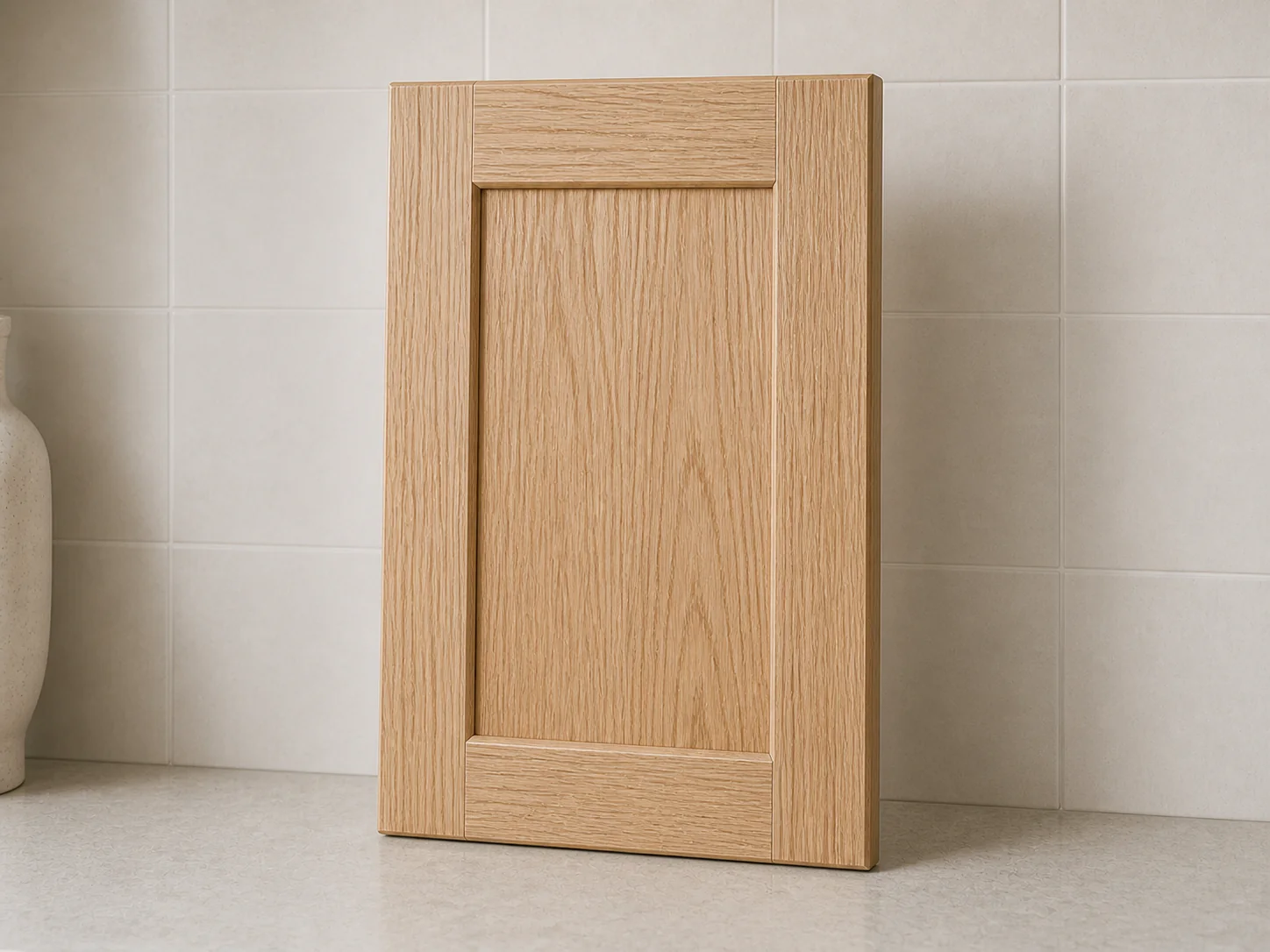
Oak has a strong, open grain that tends to stay visible under almost any stain. Stain often settles deeper into the grain lines, so the pattern can become more pronounced rather than less.
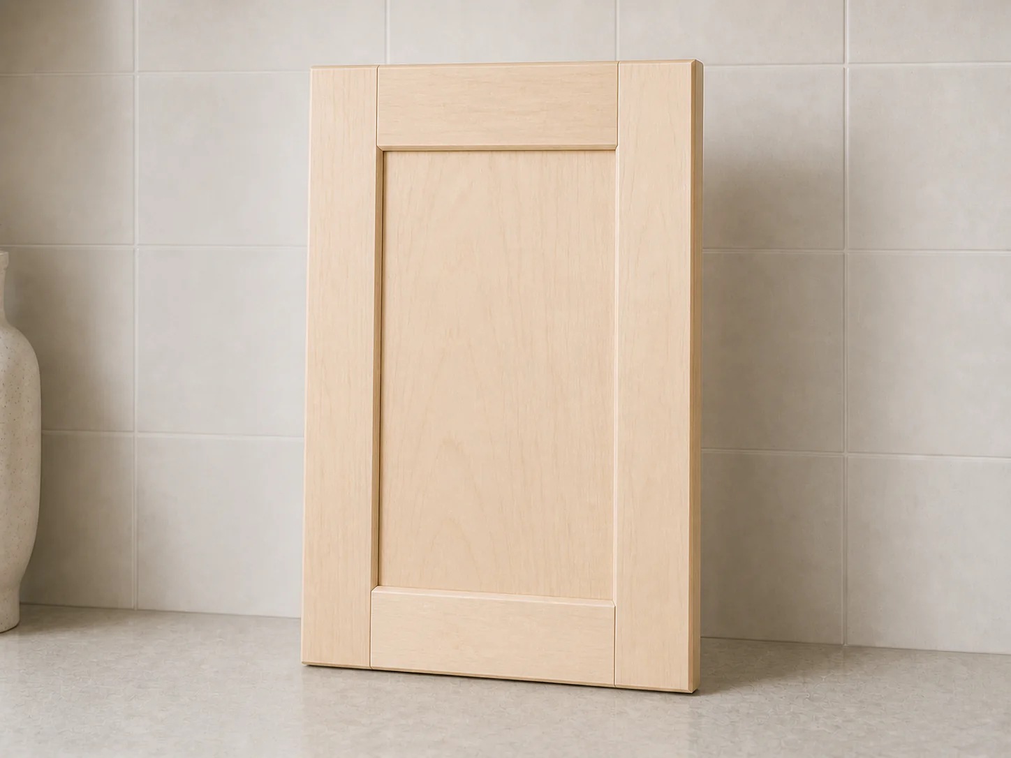
Maple is dense with a tight, subtle grain and a pale base. Because it can absorb stain unevenly, darker directions may blotch, so many finishers test conditioner or adjusted application on maple first.
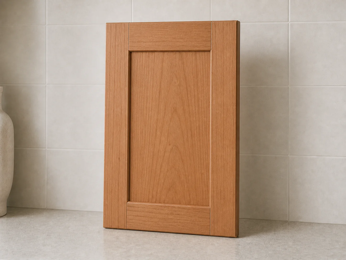
Cherry starts with a naturally warm, reddish base and often darkens further with light exposure over time. Because the wood's natural color still shows through a stain, the same product can read warmer on cherry than on a paler wood.
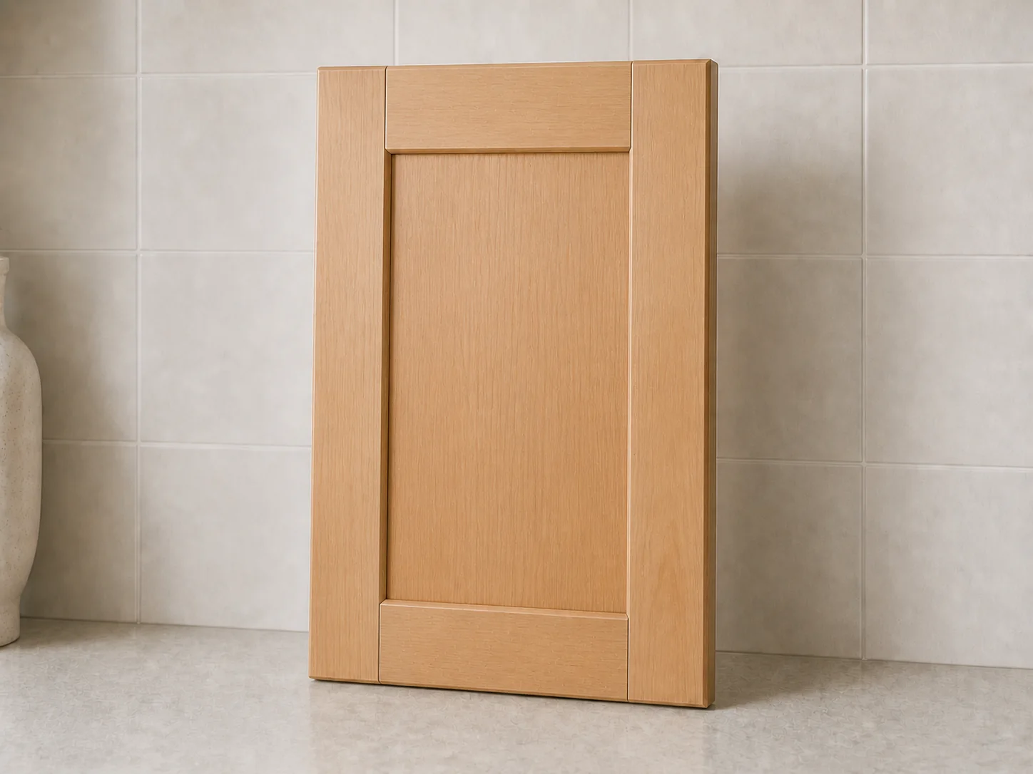
Alder is a softer wood with an even texture and a light tan base. It can absorb stain unevenly, and it is often chosen as a base for finishes meant to approximate other woods, so samples matter here too.
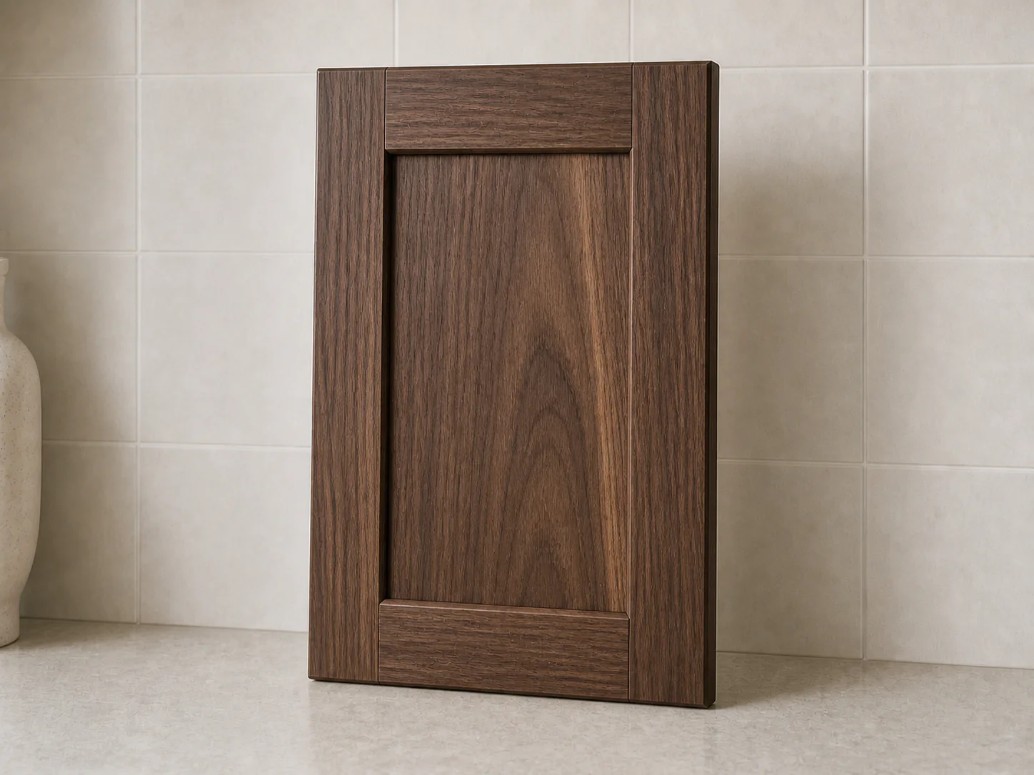
Walnut is already a deep chocolate brown with flowing grain, so it is often finished clear rather than stained. When a stain is added, the dark base can make the visible shift more subtle. A 'walnut brown' stain on another wood is a color direction, not actual walnut.
A sample on a different wood species can point you in the wrong direction. Compare the final finish on the same species as the planned cabinets.
Kitchen cabinet stain colors can be light, medium, or dark in any style of room. The useful filter is not a style label. It is how the color sits beside fixed surfaces and in the real light of the room.
Compare every sample in the room's actual daylight and evening light, not only under store lighting.
Compare each stain beside the countertop, backsplash, floor, and nearby trim. Those surfaces are more reliable than a standalone color chip.
Decide whether the stain reads yellow, red, gray, or neutral in your room. A simple brown label does not explain the undertone.
Narrow the decision to a broad family before comparing small shade differences. This prevents dozens of samples from becoming visual noise.
If the backsplash is still undecided, test that surface separately in the kitchen backsplash visualizer before treating it as a fixed reference for the cabinet stain.
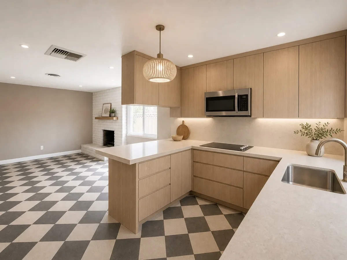
Screens and AI previews cannot reproduce the exact result of a stain on a particular wood or in your room lighting.
Method and limitations: the seven families on this page are broad decision aids, not exact manufacturer finish matches. No screen color, example image, or AI preview on this page shows the exact physical result of a stain. Species, grain, sample variation, preparation, finish process, sheen, and lighting all affect appearance, so the final choice should rest on a physical sample.
Upload a kitchen photo and keep the countertop, backsplash, floor, and lighting visible while you compare broad cabinet finish directions.
The preview is for direction finding. It is not an exact stain, wood species, sheen, or manufacturer sample.
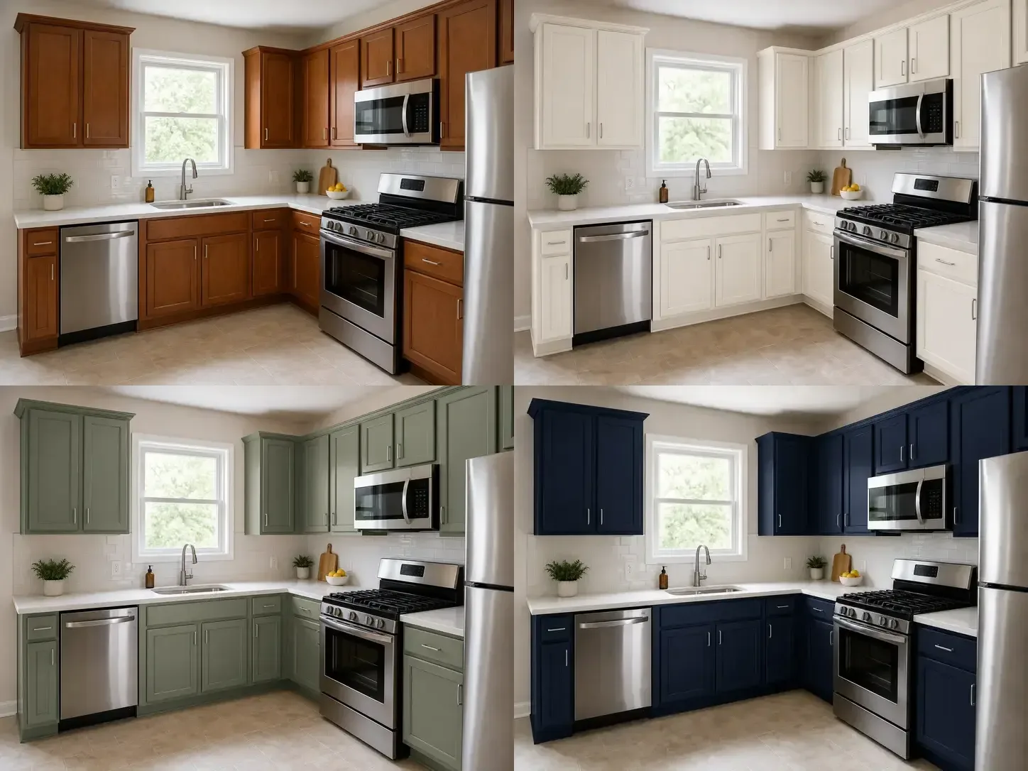
There is no universal best stain. Natural and pale stains keep a kitchen lighter, medium browns add warmth, and walnut or espresso adds contrast. The best direction depends on the wood, room light, countertop, backsplash, and floor.
There is no single answer across every manufacturer, wood species, and kitchen. Instead of choosing by a popularity label, compare a light, medium, and dark family against the surfaces and lighting in your own room.
It may be possible, but the existing finish, cabinet material, door condition, and target color all affect what is practical. This guide cannot assess a refinishing project from a photo, so ask a qualified cabinet finisher to inspect the cabinets before committing.
No. Wood species, natural color, grain variation, lighting, and the finish process can change how a stain appears. Compare a physical sample made on the same wood species as the planned cabinets.
It does not need to match exactly. It should look intentional beside the floor. Compare undertones and contrast so the cabinets and floor do not look like two almost-matching browns.
No. An AI preview can help compare broad directions such as natural oak and dark walnut in your room. It cannot reproduce an exact manufacturer finish, wood sample, sheen, or lighting condition. Use it to narrow the direction, then confirm with physical samples.